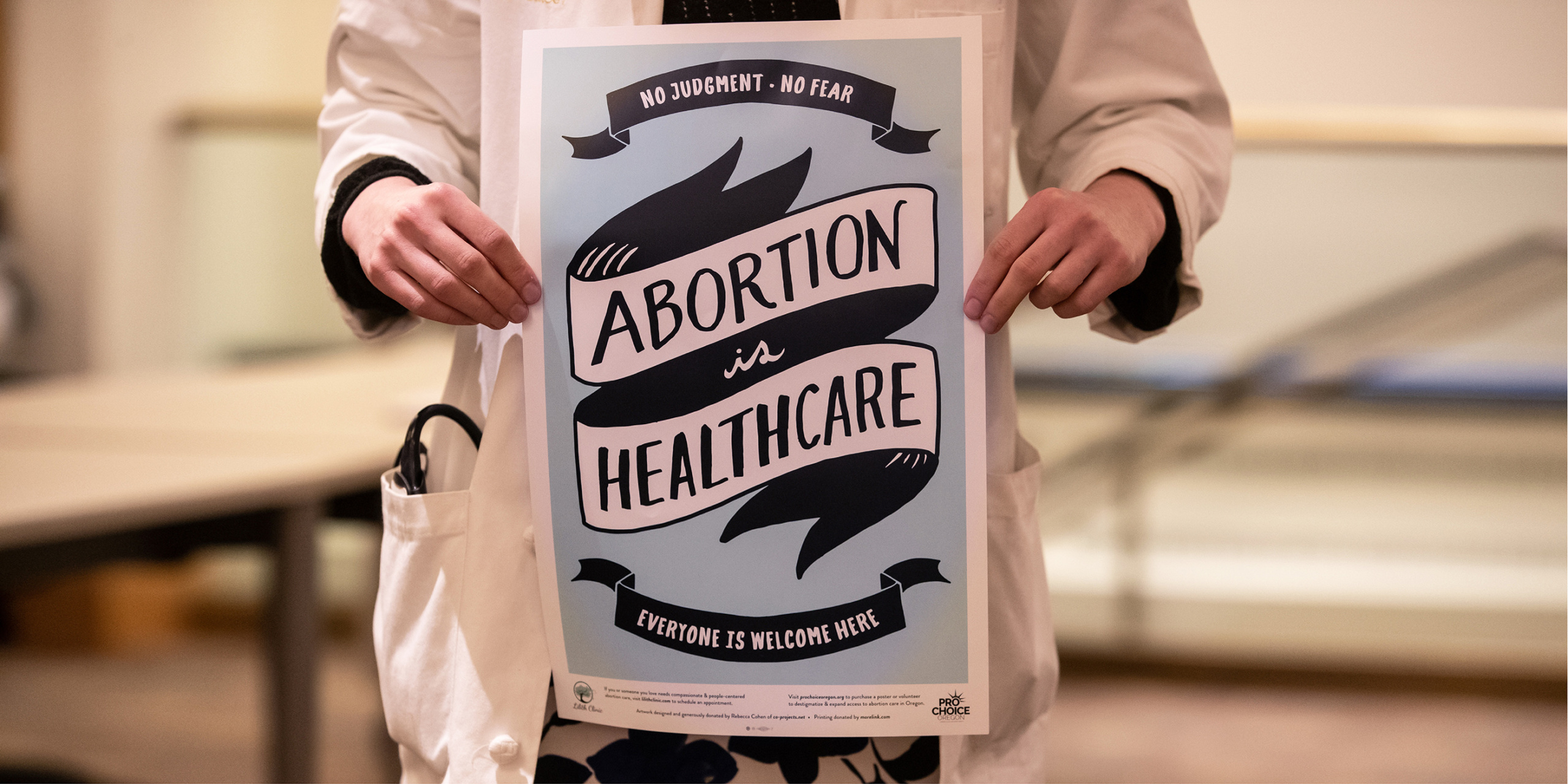
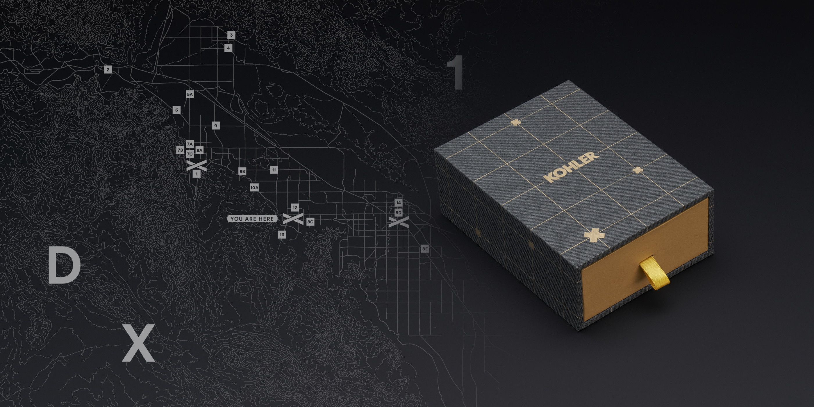
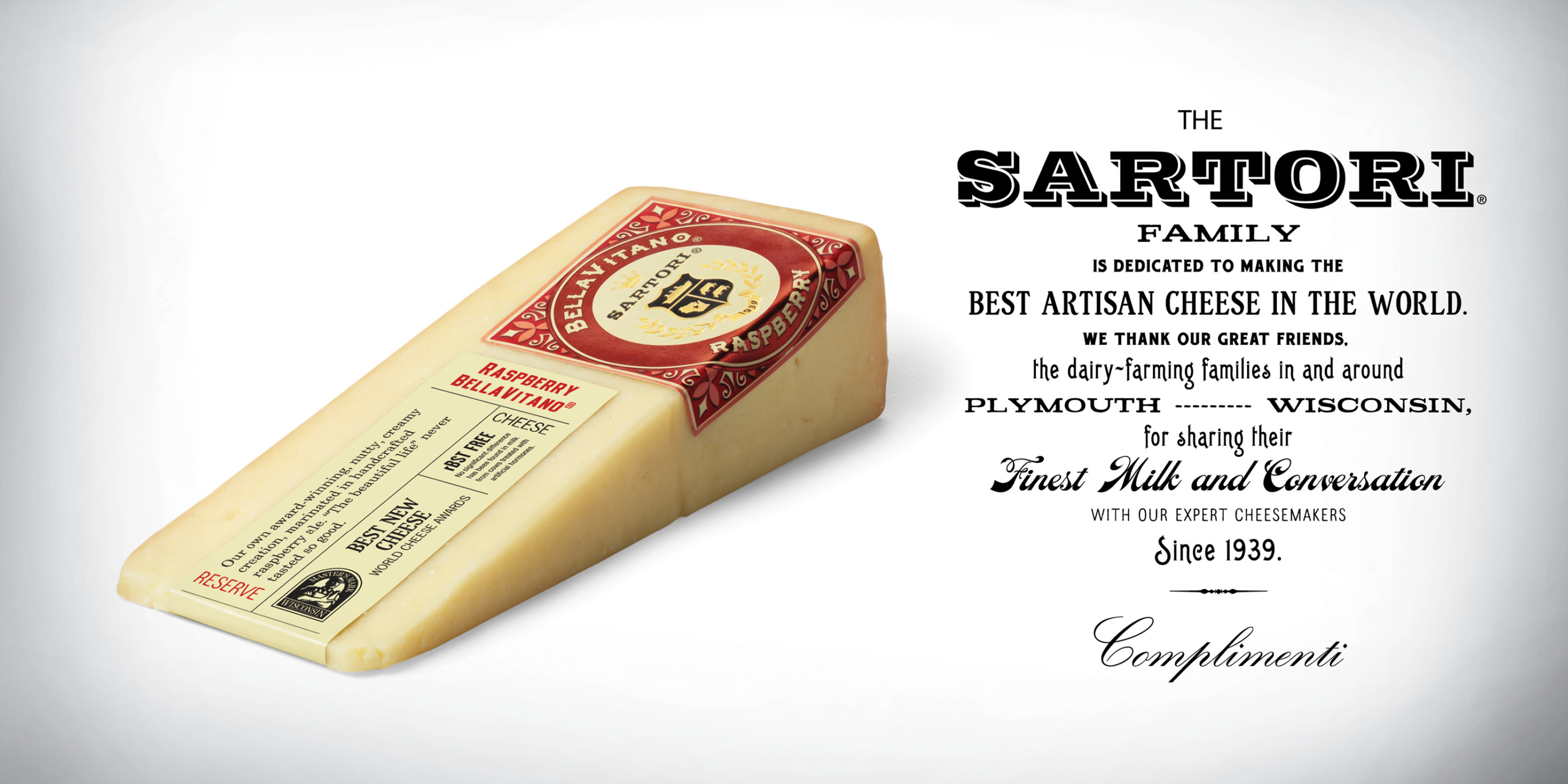
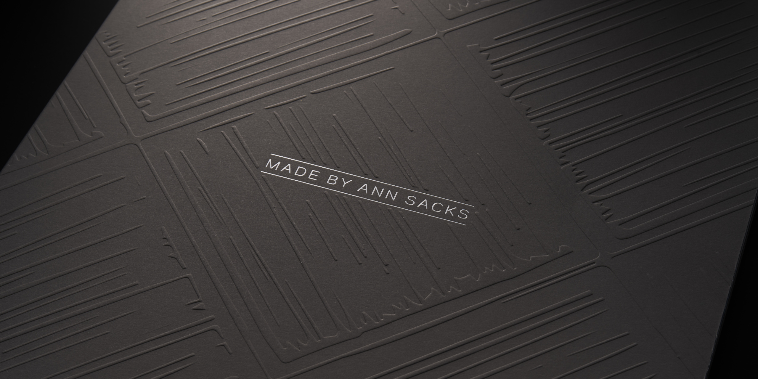
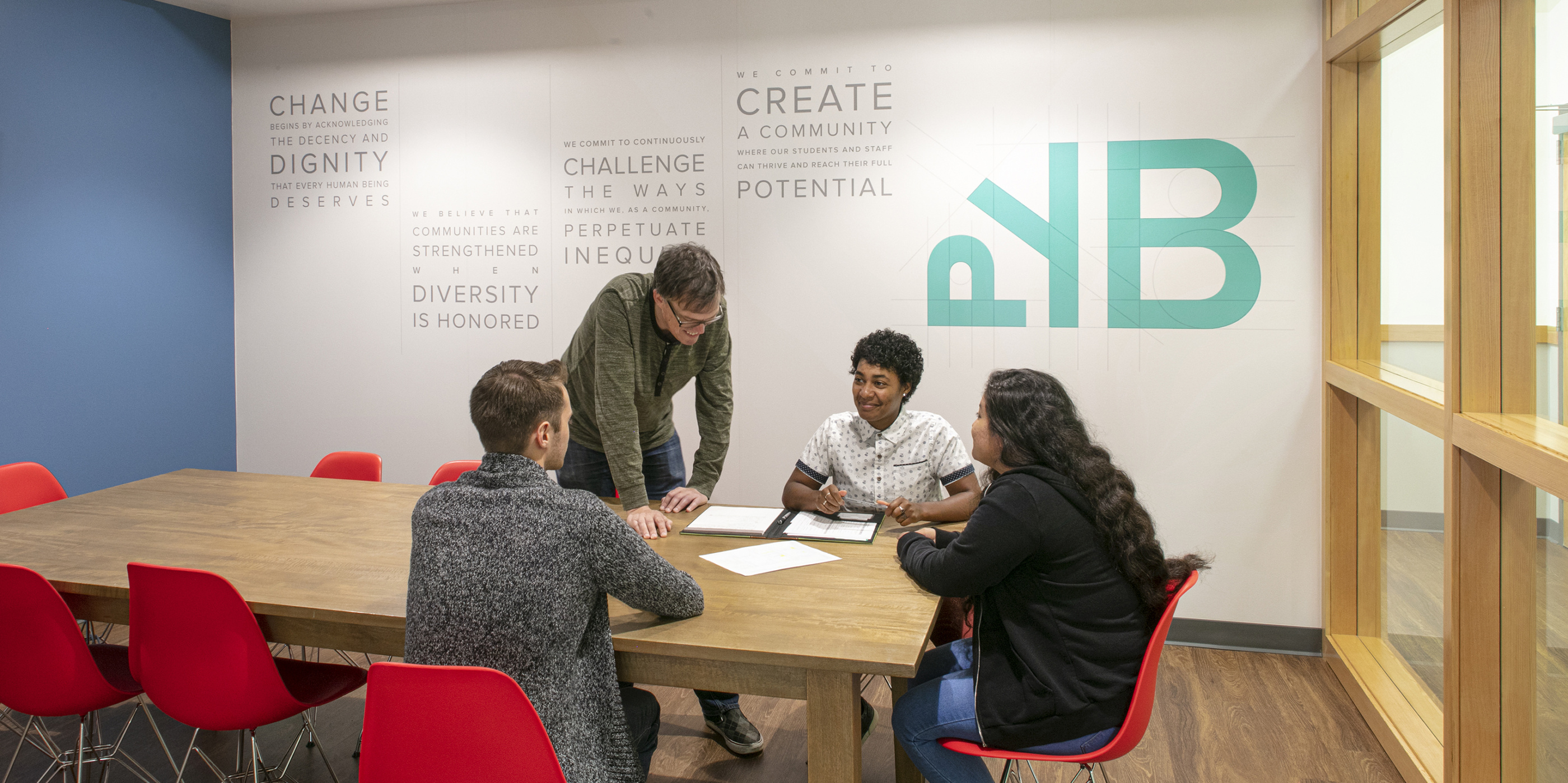
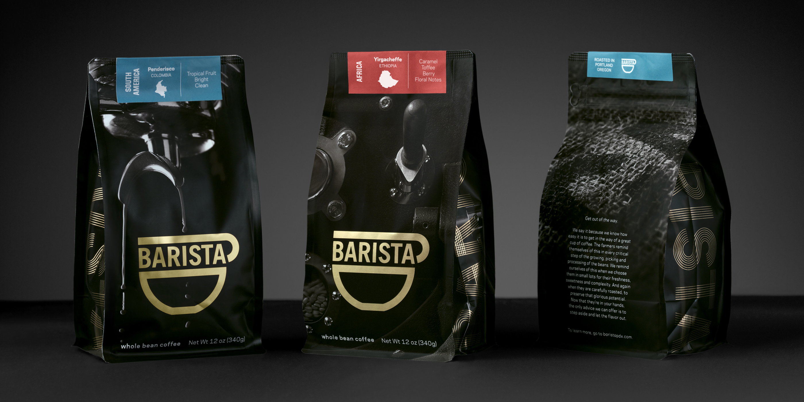
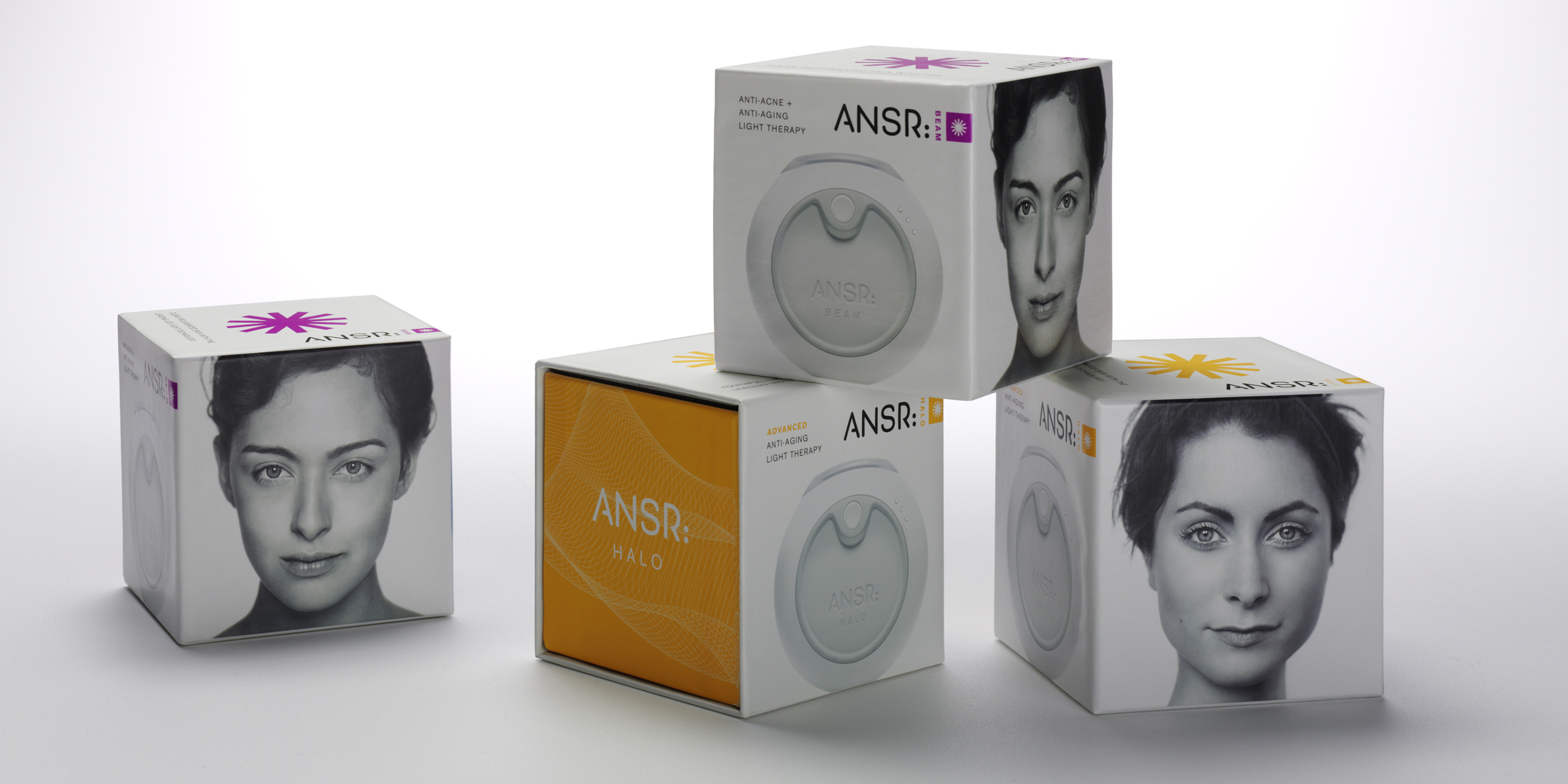
-
ANN SACKS INFINITY
To illustrate the myriad combinations possible with the 11 tile designs in the Ann Sacks Modern Collection, CO Projects devised this alluring set of flash cards. Enveloped in an origami-inspired enclosure, the 57 cards feature graphic black and white depictions of tile patterns, along with beautiful product photography and bold typography.
2013
Creative Direction, Graphic Design, Packaging
-
ANN SACKS New Collections
To unveil Ann Sacks' new collections for the annual Kitchen & Bath Industry Show (KBIS), CO Projects created this luxe set of brochures. Tonal specialty inks on the sleeve lend a tactility evocative of leather or snakeskin. Each of the 5 brochures features beautiful product photography and silver foil accents to communicate the sophistication of Ann Sacks' product and brand.
2013
Creative Direction, Graphic Design, Packaging
-
ANN SACKS
Luxury tile company Ann Sacks commissioned CO Projects to design this high-end brochure for the 2012 Kitchen & Bath Industry Show. An embossed, foil stamped sleeve, inspired by a field of tiles, holds nine individual folios, each showcasing a unique collection of new products.
2012
Graphic Design, Packaging, Print Design
-
BOYD'S COFFEE
Boyd's Coffee, a Portland mainstay since 1900, came to us to help relaunch their brand, which hadn't been refreshed since the nascent days of the Northwest coffee movement. Working with the inimitable Austin Howe on concept and copy, we mounted a parallel campaign of advertising and rebranding, based upon Boyd's history as a good, dependable cup of coffee. Armed with market research provided by our partner Michael Connell at Commonwealth Seattle, we leveraged Boyd's extensive historical archives and numerous innovations to launch a comprehensive new identity as the Everyman's coffee brand that grew up with Portland.
2012
Advertising, Branding, Creative Direction
-
BROOKS PURE PROJECT LAUNCH KIT
The PureProject line of minimal running shoes is a dramatic departure for Brooks Running. As such, it required an equally dramatic unveiling. Fashioned from bamboo, the kit embodies the sustainable ethos of the PureProject line. The laser-etched lid lifts off to reveal 2 brochures and 4 raindrop-shaped canisters with branded caps. The individual canisters may be removed and re-used in various ways. This kit is designed to be a keepsake, with no material going to waste.
Two brochures fit within: the product-centric booklet features exquisite photography from acclaimed fashion accessory photographer Kenji Toma. It's accompanied by a tongue-in-cheek instruction manual for creative upcycling of the kit. A quirky cast of illustrated characters demonstrates various ways to re-use the elements.
2012
Art Direction, Graphic Design, Packaging
-
SNL: THE GAME
This is what they call a "good problem"– naming, designing and packaging a game which draws on 40 years of SNL history. Our solution was to capture the raw immediacy of SNL's writing process and live performances, which we achieved through hand-drawn illustrations of legendary characters and catchphrases. The package also communicates the fun of playing the game itself, which combines trivia, improv, and quick-fire team play. Discoverable images are hidden throughout the whimsical NYC street scenes depicted on the inside of the box. The pure yellow package, punctuated by gloss black illustrations, jumps off the shelf in a crowded retail setting.
2012
Graphic Design, Illustration, Packaging
-
BLUE MOOSE
When asked to re-imagine the labels for Blue Moose's line of hand crafted spreads and dips, we decided to embrace the quirk. Working with illustrator Howell Golson, and agency The Great Society, we created an endearing moose character who embodies Boulder through his love of the outdoors. What started out as a small tweak mushroomed into rebranding an entire line of 25+ varieties of hummus, salsa and spreads.
2013
Branding, Graphic Design, Packaging
-
SARTORI CHEESE
Sartori is an artisan Wisconsin cheese brand founded in 1939 by Italian immigrant Paolo Sartori. We collaborated with agency The Great Society to help this family–run business rediscover its roots. The premium brand is rooted in Italian-American culture, a culture which carries different visual cues than its European counterparts. CO created a visual language steeped in this history, bringing depth and context to the brand.
2012
Branding, Creative Direction, Packaging
-
ANSR Acne Care
When this startup company came to us for branding an effective new technology that uses light therapy to diminish acne, they didn’t even have a name. For anyone who suffers from acne, there never seems to be a real answer. So we named it ANSR: By using clean, identifiable colors and symbols, we communicated the positive feeling of the brand and the simplicity of its use.
The first phase of the project involved branding and packaging the product for online retail and direct mail, so we devised a self-mailing package with every element considered.
When it was time to expand the line and package it for department stores, we named the two products Beam and Halo. The package incorporates a drawer-like opening to house the skincare device, gloss inks and pop spot colors. CO art directed the photography to position the product within the luxury beauty industry.
2012
Branding, Creative Direction, Packaging
-
BROOKS PURE PROJECT BRANDING
Branding the PureProject line required an identity that embodied the Branding the PureProject line required an identity that embodied the minimal philosophy behind the shoes. A simple logo is accompanied by a family of wordmarks which identifies each of the 5 shoe models in the debut collection. Usage and application of the system is laid out in an extensive style guide.
Agency: The Great Society.
2012
Art Direction, Branding, Graphic Design
-
BOOK COVERS
We love to read. We love books. We love designing book covers. Long live the printed page!
2012
Graphic Design, Packaging, Print Design
-
HOLLY YASHI
Holly Yashi is a popular, romantic jewelry line designed and produced in Northern California, but their brand was in need of a refresh and re-introduction. What followed was an overhaul of their entire aesthetic, including a new catalog design, photography direction, packaging and identity.
2012
Art Direction, Branding, Creative Direction
-
SEEDS OF CHANGE
Seeds of Change realized that their brand was in need of refreshment. We felt that they not only had to challenge the typical bland view of organic products, but that they also needed to be true to their background as experts in seeds and farming. We knew that no other brand, organic or mainstream, could own that story.
2012
Art Direction, Graphic Design, Packaging
-
CRANIUM WOW
Cranium Inc. wanted to re-package their flagship game as part of an effort to differentiate between adult and children’s games. We crafted the quirky personality of the game by using wiseacre copy, double-entendres and a little touch of existentialism. Gary Baseman’s original four characters were given detailed life stories. The outside of the box is wrapped in copy taunting the consumer to play.
2012
Art Direction, Creative Direction, Packaging
-
NEWMAN'S OWN WINE
When Newman's Own entered the crowded wine market, their vintner wanted to elevate the brand with a specialty presence. Paul Newman's iconic face still needed to grace the label and marketing materials, but we chose to emphasize his Butch Cassidy outlaw personality in the brand voice. Two retail campaigns were designed, for the holidays and for summer.
2013
Creative Direction, Graphic Design, Packaging
-
ELLINGTON
CO partnered with 14 Hands agency to rebrand Ellington Leather, a local handbag company with a rich heritage and loyal following. A sophisticated new ID system was unveiled, including bespoke patterns which are used as an additional branding element in bag linings and packaging. The branding extended to updated retail signage and displays. To show how the new identity would come to life, we created a hand-stitched and bound 'look book.' The book acts as a style guide for the new branding, covering usage of logos and patterns, color palettes, photo direction and typography.
2012
Art Direction, Branding
-
COCA COLA
When Coca-Cola asked us to create new visuals for their global brand to help them resonate with a younger and more international audience, our ideas were very well received. We soon found ourselves in the enviable position of influencing and directing Coke’s ad agencies around the world, guiding the global presence of Coca Cola Light.
2012
Art Direction, Branding, Creative Direction
-
NIKE WOMEN
Art direction and design of retail initiatives, print campaigns and photoshoots for the NikeWomen brand and stores.
2012
Art Direction, Graphic Design
-
NIKE
Art direction and design of Nike projects ranging from retail initiatives to packaging to apparel graphics.
2012
Art Direction, Creative Direction, Graphic Design
-
X BOX
The XBox 360 Live Avatar Marketplace allows gamers to purchase apparel for the avatars which represent them in online play. CO designed virtual apparel collections such as "Steampunk" and "80's Modern," which sell alongside branded apparel from the likes of Adidas and Roxy.
CO was then asked to design a series of posters and banners for Microsoft's internal campus launch of the Avatar Marketplace. Armed with low-resolution assets, little content, and less than a week for design and production, we came up with a lively and arresting family of visuals. The quotes were taken directly from gamers, raving about the collections on online forums.
2012
Art Direction, Game Design, Graphic Design
-
DUO
Duo hardware and software convert the iPad into a digital gaming device for group play. The packaging and branding convey a sense of fun through a sophisticated aesthetic, allowing the product to partner naturally with Apple products in retail settings like the Apple Store. The box features the Duo logo hovering above the devices, casting a dimensional shadow on brightly colored backgrounds. Product names Plink and Pop were developed for simplicity and to mimic the sound of game-play. Conversational instructions join comical illustrations to communicate whimsy and tech savvy.
2013
Art Direction, Branding, Packaging
-
PORTLAND CENTER STAGE
Diverse styles of illustration from Portland artists distill the concepts of each play. Bold and metaphorical images fit within a common framework to form a graphic family. Some feature strong typography while others rely on humor to convey their farcical character. All are meant to celebrate the freshness of Portland’s newest venue in its inaugural season. The self-mailing brochure celebrates the opening of the new Armory Theater in Portland’s Pearl District.
2013
Creative Direction, Graphic Design, Illustration